Monday, 25 February 2013

Final major - fabric

I have visited fabric stores and flicked through websites for a while now hoping that something would leap out at me shouting couture budget  and it has been painful to say tbe least.
I visited a fabric shop on line that supplied cheap muslin. So I purchase some for sampling. Once it arrive I tested starch on it to see how it would work on the muslin. The results were pretty good and I though excellent, I have my fabric however after watching the the first episode of Signe Lagerfeld and learning that couture toiles are made of muslin tbe put my off using a toiling fabric for my collection. I want budget fabrics wih coutue designs made in a way that could be mass produced. Street Couture.
I liked the idea of using jersey/t-shirt fabric, a fabric that is more than often used by high street and perhaps tbought of as cheap. If I used fabric often used by high street and gave it a coutue makeover then I could get the look I am after. So I bought some £1.80 per metre white jersey.
Looking back through my sketchbook I liked tbe look of the scaffolding and weaving styles. I have played around with an old tshirt and I think my results could work within my design development.
Things to do - Design develop around jersey and the above technique

Tuesday, 12 February 2013

Starching Muslin - How far can you go????

Well after researching how to make muslin stiff, I have decided to start with spray starch. Dylon Starch. I have cut my muslin into 30cm squares and sprayed one so that it was stiffened, whilst keeping one plain, without starch. I then hemmed each on all four sides and folded and ironed it into an origami geometric pattern.
Firstly, the un-stiffened muslin:


It was floppy and lifeless, it didn't hold itself well even after ironing and when stitched to hold its shape it just lacked confidence.
The lines looked untidy at the centre and where all lines met it was uneven and lacked a professional look


Secondly, the stiffened muslin:

If was clean and sharp, it held together well after ironing. It was easier to mould so that the lines met cleanly at the centre and it gave the piece more volume and life.
It would need to be tested on dyed muslin also as there was a slight colour change when starch was added. I would also need to assess how much it would effect the dye and whether it would add to the dye running once I'd gained the pattern desired. I also want to see just how stiff I can achieve and how much starch that would require.

Valentino Exhibition

I have taken a trip to Somerset House and the Valentino: Master of Couture Exhibition - open until 3rd March. The exhibition displays dresses and outfits, designed by the house of Valentino, all couture and all very beautiful, stretching from the 1950's through to the 2000's. It displays many couture techniques along with videos of how these techniques are achieved, along with exerts from the Valentino virtual museum, which can be found at http://www.valentinogaravanimuseum.com/

The exhibition showed a total of 130 outfits, and although they each held a beauty that is un-levelled, my eye was drawn to a collection of outfits that displayed some interesting techniques that I would like to experiment with and see if they could be reproduced at high street level. Techniques that can be affordable for the everyday fashion fan.


Valentino's Haute Couture SS08 pale tulle evening suit with small appliquéd origami shapes, embroidered with tiny pink glass beads.

This idea could be assimilated into my designs, look into making muslin origami shapes that could be appliquéd onto outfit.
Look into playing with size and stiffness.


This Valentino dress, from the Haute Couture SS03 collection, has inserted transparent godets and is finished with beading around the arms.
Its an interesting idea to add a little transparency within the dress, this looks very revealing without allowing the wearer to feel naked. I also like the added beads around the arms, it gives a feeling of delicacy and softness, a little detail in a very otherwise simple yet glamorous design
I could use the idea of having a simple design with splashes of detail, this would enable the design to be beautiful and couture inspired yet keeps the cost down and so allows a high street price tag.


www.instyle.com
I like the detail of this Haute Couture Fall/Winter 1992/93 dress, worn by Julia Roberts to the 73rd Academy Awards on March 25th 2001.

The detail on the reverse of the dress is incredible, the idea of the ribbons the cascade down into a fan of material.

This idea could draw in the concept of structure within building scaffolding, it highlights the lines and brings an additional level to the shaping.

I would also like to look into the lines and how this could be used as it sits well with my theme of caging and scaffolding and structure.

This could also be seen in Valentino's Haute Couture SS1993 dress that uses a technique called budellini, which involves coating wool in a skin of chiffon, like long worms or sausages.
This is something I would like to look into using, but with something that has more body than wool. I have had a conversation with my husband and he suggested using windscreen washer tubing, so he has ordered me 3 metres and I will experiment with it, coating it in muslin.

I also like the idea of creating a collection that looks tactile, that has volume and makes you want to feel it.
Fall/Winter 2007/08
Valentino exhibited many outfits that made you want to touch, unfortunately that is out of the question, but that is not to say its not possible to recreate that feeling.
Fall/Winter 2007/08 had a technique called Paigine, which is hundreds of disks made of organza piled to create a pages of a book effect. This is interesting and could work with the edges of the origami squares that I can create.


Fall/Winter 1986/87
 Finally there were dresses that used a technique called Drappeggio, a couture technique with chiffon and crepe sild draped on the bias, the draping is done in gathers, with shades of colour to form a waterfall, rippling water effect.

Spring/Summer 1992
and a technique called 'Tappeto di ruches', which is a couture technique of strips of tulle sewn to a bias fabric to create a flat surface of tightly packed ruffles - (all Couture technique definitions have been taken from the guide book given at the exhibition).

All of these techniques called be experimented with to find a more high street technique, something more affordable.

From this exhibition, I will need to do quite a bit of experimenting and research into fabric properties and how colour will work with different processes

Sunday, 10 February 2013

Major project update

My sampling fabric has arrived, four metres of white muslin, so I went out and bought a can of starch. I am going to research the fabrics properties and what shapes can be acheived.  I can see what happens to its structure when a stiffening agent is added. I will also dye some too, this will help me understand how intense a colour change would be and it will give me an idea of shrinkage, as making the fabric wet may lead to the width or length shrinking.
I will start tomorrow, and I am looking forward to it!!!

Wednesday, 6 February 2013

Major Project

I have been considering fabrics for my Major Project.
The themes of my major project are structure, such as in buildings and scaffolding and caging, but also Origami within fabric manipulation. My concern is that this is quite a predictable theme, Origami has been done by fashion students and over done. I want my final outcome to be as far away from the usual Origami outcome as it can be, strive for something new and buck trend.
For these reasons I have been initially looking at satins and taffetas  this is a very obvious choice though and one that would be very predictable. I have therefore been looking into changing a fabrics properties by adding chemicals such as starch or even interfacing, and it has become very apparent that muslin can be manipulated quite easily. Muslin is 100% cotton and therefore also holds the potential to dye well. This could add another dimension to my design process, print. I like the idea of adding print and would love to work within print design in the future, so would be very beneficial to go through the process of print design for my major project.
I have ordered 4m of muslin in white to research what can be produced with this fabric, how it hems, how it can be folded and draped and how it can be dyed and starched.
If i do end up using this fabric I believe i will need an additional fabric that will work with the muslin but help provide another dimension to my work and also help provide additional structure where needed, ordering the 4m sampling fabric will provide me with a sample to shop with, helping make additional selection easier.


To Do:
Shop for additional fabric
Await delivery and then, dye it, hem it, starch it and drape it. Photos, photos, photos!!!! Samples, samples, samples!!!

Monday, 4 February 2013

Professional Practice - the outcome


A Critical Analysis of the Professional Practice Process

In reflection I believe I completed the exercise in the best way possible for me. Firstly I prepared my CV and portfolio so that I was sure they represent me in the best possible way, one is no good without the other when applying for a creative role. It is my belief that when you make your first contact with a potential employer, you need to bare in mind that it may only be the first contact of many before they actual pay attention and consider your requests seriously, it is therefore important to make sure that the impact you leave is a positive one. Maybe I will not hear back from any of the brands that I have contacted, but if I choose to apply for a position with the brand or the individuals that have viewed my submission again, in the future I may be remembered from my previous contacts, and if so, I want to ensure that the memory is positive one. This would require ensuring that the presentation of my efforts reflect me well and that all correspondences are consistent and of a professional standard, including being well thought-out and not look as if I have rushed the work. It is important that my CV and cover letter are creative, honest and well researched, which includes without error. That any work they may see is of the highest quality and reflects my abilities, whilst also showing my potential.

I learned a lot about researching from this process also, about researching a brand before writing the covering letter. This is something I didn’t understand until I followed the instructions and only then as I wrote my first covering letter did I see the importance and the power it can provide you with.

I now understand more about the companies I have researched, companies that I had assumed there was little left that I could learn about them, knowledge that will place me in good stead should I acquire an interview.

When it came to the format that I ended up sending the CV and portfolio in, I spent a long time  deliberating over whether it should be sent be email or by post, if I were to send it digitally, it would turn up immediately, without delay, it is a process that requires no finance to carry out and I can send almost all of my portfolio, however I would be unsure that the email was read or just discarded without any viewing, which is common with unsolicited emails within business. If I were to send it by post I can tailor make the entire package, my CV, covering letter and work can all reflect my creative flare. I can ensure that it stands out by using special paper, or writing style. I also think this process is harder to ignore, however it does have its drawbacks, It require a lot more work and it is very costly for printing.

I decided that a compromise was to send hard copies via the post but to send only a handful of images to each, making sure the ones I selected represent me accurately and that they were best suited to the brand I was writing to, a tailor made package, whilst ensuring the cover letter and CV highlight how my entire digital portfolio could be viewed. Although it is not the way I would wish to send them, it is still, in my opinion, better than emailing; it is more personal, more thought-out and shows an eye for detail and presentation. I think it represents me in a more positive manner. I am happy with the way in which I have carried out the process and look forward to the process when I have completed my studies and am ready to take on the working world again, at the end of April.
Not long now and hopefully this exercise will help as the companies I have contacted are all ones I would be very excited to work for.

Tuesday, 29 January 2013

Professional Practice - Getting a Job!!!

I have been amending and updating my Blog so that it contains a digital portfolio of all my work, during a tutorial it was mentioned to me that a few of my pieces were portrait whilst most were landscape, and that I should choose which way round I wanted my portfolio to be and amend all boards to reflect that decision.

I have now amended all my work so that it is Landscape and I am really happy with it.

I have set up my Linkedin page, which includes my CV and a link to this blog. All of these things were quite time consuming but let me tell you, worth it. Although I have had little activity for either pages, I am proud of my work and I am happy for the world to see it, hopefully all the hard work will pay off and I will get my first design job soon!

I have still to send off my CV and I have decided that initially I am going to send it off to:

Tesco
ASOS
Debenhams
George
The Arcadia Group

I have also decided that based on the fact that I have person needs for a fully paid job and that I have quite an extensive employment history within the fashion industry, I am going to send the work, CV and covering letter off in the hope that I get some interest for a fully paid position, whether that be full or part-time. It will if nothing else prepare me for my job seeking once my degree is completed, and hopefully my work will be remembered at that time and a job will be available for me to interview for.

I am quite optimistic that my previous employment history will definitely be a useful tool when scouting for a job, my understanding of a products life-cycle can only be an advantage, but in addition, my experience working to deadlines and preparing creative presentations for clients can only place me in good stead for my future.

Monday, 21 January 2013

All Saints - Trend Analysis cont...

Next step was to take a look at designer trends that would influence the All Saints design process.
I have taken a look at, Diesel, Topshop Unique, Vivienne Westwood and Phillip Lim, to name but a few.

I looked at Skirts, Jackets (leather and cotton mix), dresses and tops.

Dresses:


There was a lot of draping on the catwalk, from Westwood and Topshop. This seems a strong look and should be included within the design process.
The fabrics seem either soft cottons or fine jerseys.
I think I will use jersey, as this hugs the from with ease and comfort. All Saints are more about comfort than structure.


Jackets:
Bernard Chandran, showed the nipped in waists and a very natural, effortless look

With Leather jackets, the fabrics look thinner and the styles look either nipped in at the waist or boyfriends jacket styling.
Whilst Helmut Lang showed a mix of colour and fabrics. Using panels to exaggerate colour.
But we also had a lot of asymmetric styles, including Salvatore Ferragamo with muted tones in lux leather.


We also had Vivienne Westwood show jackets with volume and folds, draping and layering, with nipped in waists and uneven hemlines.
She also had wide shoulders, with a soft structured look.
Colours were muted, earthy tones, with a worn-in look to leathers


Skirts:


Yamamoto
Long and short, with worn edges and panelling. Short skirts had gathers, layers, panels and volume. Uneven hemlines and comfort.
Colours were muted tones and natural moods. Atsuro gave us panelling with a difference, the denim long maxi skirt had frayed edges, in a very light worn blue. Topshop showed us how to wear a smart skirt, and make it look comfortable but elegant, with a wrap, asymmetric, uneven hem-lined white skirt, whilst Titel showed panelling to the max, in shades of black through greys and played with grain-lines and symmetry.

Tops:
 Long shirt like tops, with pockets and panels, and an ease and non-restrictive look. Soft silks and natural linens and soft cottons.

All Pictures are from www.stylesite.com


All Saints - Trend analysis

I started looking at the All Saints website, which has a few new season items for the Spring Summer range, although more pieces would be added as the season closes in, I would think.

Colour:
Colour is muted tones, with a few pieces in light greys and off whites. A few colours are used to lift the muted tones with a little teal and silver, aqua and dirty pinks being used within prints and embellishments.

Silhouettes:
Whilst most garments are sympathetic to the female form, there is always a simplicity and an androgynous feel to the items, which reflects my interview findings, that items that do well will often be subject to minor alterations in order to be able to sell within the alternative section, men's wear of women's wear.
Asymmetric lines and draping is also apparent, with boxy lines used for jackets and outerwear.

Lines:
Tops: nothing too fancy, very casual looking items that could be dressed up with some styling knowledge, or confidence. Graphic prints seem very important to the All Saints signature and it would be silly if this was over looked within my collection.
Dresses: jersey, draping and print. The draping is kept to a minimum and the fabrics seem rich and soft.
Skirts: Leather seems to be the fabric of the moment, however I believe that as summer creeps in this will change. Mini skirts and pencil skirt, but this reflects the autumn winter trends.
Leather: Jackets are made with men and women in mind with a few pieces that are more feminine or masculine. Leather tops, and trouser as well as skirts with very expensive looking and feeling leather.
Jackets: Boxy, classic and simple styles. Some draping and clean lines.

With the interview and the store visit, along with the research online at their All Sites site, I have managed to put together a Customer Profile.

I then looked online for SS13 trends.

Stylesite is an amazing tool to look into future trends and I started with colour trends for SS13.
I looked through all the trends and felt that the muted tones where the most appropriate feel for All Saints and from the three main colour moods, it is my thought that NEUTRAL is most sympathetic to All Saints.
After continued research, I think that FAUX BLACKS would be an accent colour that would be included within the brand for SS13


I then continued with prints for spring summer, as this seemed to be important to All Saints. After looking through all the print ideas I rested on The Beauty Within. After visiting the store it was obvious that All Saints liked the grungy rock chick look, and this included many images of skulls, which seemed to be reflected within this print mood. I have decided to create a print that can be used throughout the range but mostly for their graphic t shirts range.

To Do:
1. Create a print for designs
1. Start design development

Monday, 7 January 2013

All Saints Interview

I have managed to carry out an interview with a  employee from All Saints head office.

How do they design?

They have a very intellectual approach to employing their design team, they make sure that all areas are covered and that they have an expert in each area, whether that be hand drawing or CAD drawing, embellishment or Tailored Wear. An example of this is that at that time the Head Designer thought little of his drawing skills, they were not what he would call where his expertise lie, but he made sure that he had people around him that he could rely on to do his sketching for him.

They make sure that their mens wear and women's wear compliment each other and that the teams work closely with each other so as not to miss any key design crossovers, if something works well for the mens wear collection and shows growth in sales then a women's equivalent will be designed, having the same design but with more focus on the female form, nipped in wast and shaping for the bust.

How important is a design silhouette to All Saints?

Its important to to All Saints to be very aware of trends and fashions, but equally it is important to design for the form, All Saints carry a lot of their design process out whilst draping on the stand, many of the silhouettes are creating from this format. Most of the designer work in 3D and not Flat.

How do All Saints see their image?

All Saints like to have a close affiliation with the music industry, this is massively important to them, they have sponsored The Kooks and Johnny Borrell from Razorlight, they have held numerous Basement gigs in their stores and sponsor the William's F1 team, including their brand logo on the F1 cars and the F1 boiler-suits, with the thought that Lewis Hamilton has upgraded the F1 image to a more rock and roll status.

Who do All Saints see as their competitors?

Mostly they see themselves as upper high-street, very upper high-street with their competitors being Ted Baker and Topshop, they do not like being compared to French Connection although their pricing is similar.

What do they see as their target market?

They like to see themselves within the 20-30yr old Fashion conscious, music lover. Someone who has a good job, someone who is quirky and has an individual style that maybe other high street stores don't cater to. they like to think that the All Saints shopper uses theirs stores for the bulk of their wardrobe and that he or she likes to dress top to tail in All Saints, they like going to gigs and like to think of themselves as a little more important than the rest of society, being invited to secret gigs, getting backstage passes and maybe living a bit of the rock star lifestyle.

What is the buying ratio for sizes?

Sizes 4 to 14, with maybe one or two jean pieces straying into size 16's. The buying ration is weighted towards size 8 with a ratio that simulates from size 4, 2-3-3-2-1, with a ethos of design wide and buy shallow, putting an emphasis on trend and design not on profit, which sympathises with a fashion conscious shopper as a design led business.

What are their signature designs?

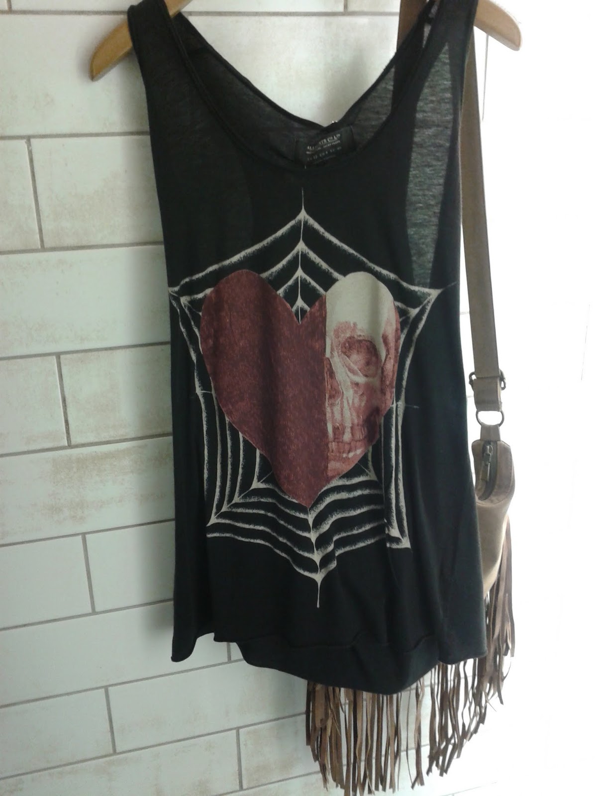
They like to produce a lot of embellishment, on dresses, on T-shirts, on leather on anything and everything, they do not like colour, they like muted tones, greys, black with a small amount of muted, duller shade of colour.

They are very proud of their leather, and have been known to sell with low margins, using the very best quality jackets. If you get yourself one good leather jacket then make it an All Saints one as they are of the best quality and they stay true to their retail points.

They also like the relaxed look, and have a vast array of T-shirts, all vintage looking with a print that is on trend.

Finally they have a growing Tailored collection, with a nod to the Italian tailoring and with an attention to the skilled techniques of tailoring, detail, detail, detail. and for all these signature areas design is the key, fabrics would be lux, detail would not be overlooked or removed for cost reasons. Design is the reason for the product and should not be compromised

Do they follow a 'Type' when it comes to employing sales staff?

Sort of, they like a quirky team, they like them to look as though they shop in All Saints but with a character of their very own, an individual look. They like the rock star look, employing staff that have bright red hair, or tattoos all over or piercing, people that may ordinarily in other job may be asked to tone done those aspect of their image.

So the key things I should remember when designing are, female form, embellishment, lux, trend and what is being shown on the catwalk but with an All Saints twist. Vintage look with a Rock Star feel. Focus on design and draping and not on colour.

I need to take a look at trends for SS13 and then look at the key pieces that All Saints actually place in store, then I can start designing

All Saints - Visit


I have now visited Brent Cross and Lakeside All Saints stores and the only real difference is the store fronts, and that is only really slight, but Lakeside have no Singer sewing machines in the store window and only display one in the store which is being utilised as a clothing rail, where as the Brent Cross store had more Singer sewing machine


Shop Window
The shop windows seem to be split, one either side of the doorway and one side showing Men's Wear fashions and other displaying Women's wear. At present due to the season we are in both windows are highlighting the fact that it is Sale season.


The Women's wear showed an outfit which included a leather biker jacket and a little black dress with a twist.


Inside the store you where welcomed with a large doorway and a very clean and sharp looking display, which delicately advertised their sale. Even during peak sale season, they do not appear to want to allow the sales signs to dominate their branding.

When you first enter the store you also become aware of space, mood lighting and nothing is bright, the walls are, although mostly painted white brickwork, they are warn and weathered, helping to create a vintage basement feel. The mannequins are cream and a little worn looking helping to give a slightly vintage feel about the store, quality over new.

The sizing, although we are currently in Sales season so selling stock that is left over from the AW12 season, appears to be weighted towards size 6 and 8, with a few sizes venturing towards the size 6 and 4, but small amounts at the top end of 12 with very few at 14 and none that I could find any higher.


The swing tag is heavy and worn looking, with a feeling of vintage and antique with a modern twist. They are made from thick card and have leather and metal detail and secured by string attaching to garment. 

The sales that where made were placed in large vintage looking off white bags with only the name Ass Saints print on the side

The clothes inside the store range from evening wear, through office wear and include everyday wear and casual. You could essentially buy your entire wardrobe from All Saint, if you could afford to.

The sales staff all look as though fashion is important to them but it looks easy and a bit rock star meets Glastonbury. They all look a little quirky and as if they have a style of their very own.

They look as though they have a design philosophy of grungy designer wear, with an attention to detail and a strong eye on trend and fashion, looking at Topshop and Vivienne Westwood. They seem to relish in their vintage looking rock T-shirts and they have a very strong leather collection including many leather jackets. These appeared to be their signature pieces, along with draped dresses and masses of detailed embellishment.

All Saints - Brief received

We have received our brief for the All Saints project, we need to visit All Saints, research the brand, design about 6 outfits that would complement their SS13 collection.

I have started by looking at All Saints online profile, they have a website that is focused on their Spitalfields branch, they have what appears to be very fashion and design focused items but they lack colour and maintain a very black, brown and muted tones palette.

I need to try and speak to someone that works for All Saints, maybe get myself and interview with someone and I need to visit a few branches of the store.

To Do:
  1. Visit Brent Cross and Lakeside All Saints Stores
  2. Try and acquire an interview with an employee
  3. Research All Saints history and ethos
  4. Research All Saints profile and image
  5. Research All Saints online store for design and collection and fabric compositions

CV and Linkedin

I have updated my CV and have amended some of the parts so that it shows my career path in what I think is it best light. I have included the link to my blog page which is also my online portfolio page and will be my link to Linkedin.
I have set up my Linkedin page and have completed it in full. This now included all my skills and all my work experience and education. It also have links to projects that I have completed and am proud of, which show the skills I believe are important to the type of work I wish to gain and the level of the market I wish to join.
Now I need to improve my connections, which is proving difficult as all the contacts I have made within my time working in the fashion industry do not appear to have Linkedin status, sadly, but I will try and gain connections regardless, positive mental attitude and all.

Blog - Updated
CV - Updated
Linkedin - Achieved and complete

Updating Blogger

I have spent a great length of time updating the apprearance of my Blog so that it has an image I can be proud of. I have cleaned it up so that it is not so busy and looks easy to reasd and easy to navigate, I have added a design pportfolio and a dress making portfolio so help with gaining job interviews and help with the two areas of the industry I have an interest in, design and making.
I am a lot happier with the outcome and although I still need to add a link to my linkedin page, once its set up, I feel it is now somehting I am happy showing others.

Things to do: Up date my CV and set up my Linkedin account

Linkedin/CV Seminar

I attended a seminar about improving your Job Opportunities by getting your CV up to date and joining the technology revolution. Linkedin, it would appear is the new online networking system that allows you to connect with like minded professional, keep up to date with companies you have interest in and to elevate your career opportunities by broadcasting your CV to other professionals.
I became aware of the importance of making sure that you maintain a professional online appearance through all social and professional networks and that you need to be aware of how your image is being presented online.
As I have no online CV I thought it would be a priority to get Linkedin, in order to do this I will need to update my CV and then use that as a tool to get my Linkedin account up and running.

Online Profile Seminar

We were invited to attend a seminar that would improve our online profile knowledge, this seminar included ideas about creating your own website and also how to improve your online presence.
I found it all very interesting and very motivating. I enjoyed learning about how to create your own www. address and the benefits of this and how to use the blogger page as a website. I also learnt the importance of using the blog as a way of introducing viewers to you as a Designer. How to layout the page and tips on how people navigate around websites.
Although I already have a Blog, I decided it would be necessary for me to revisit the themes of my page, the layout and the navigation.
To do: redesign my blogger pages so that a possible viewer would spend more time on the site and would be able to find what they were looking for with ease

Thursday, 6 December 2012

Creative Pattern Cutting


I have manipulated my pictures from my draping on the stand exercise and have added the bodice from the first exercise to the outfit from the second exercise to see if the bodice works and if it looks nice and I think I really like it.
I think it gives the outfit and the sculptured parts on the bottom of the dress, balance. I also like that it only appears on the left hand side of the garment, giving the look an asymmetric feel, but I think I will look to see what the outfit would feel like with the pleating on both sides, just so that the idea can be eliminated with fact and research and evidence.
Now all I need to do is convert the draped pleated bodice part into a flat pattern that works and can be manufactured with the existing pattern bodice.
I think I will add it as and additional layer and insert it into the middle seam and the side seam, but I will need to increase the middle hem line so that is runs parallel with the existing bodice lines.

Creative Pattern Cutting, more.

Have attempted some more draping using an alternative method. Started with creating a bodice block by draping the fabric on the stand and pinning where the darts, or panels will form. Then growing the outfit from a basic block shape so that it is more structured and angular.
I've decided to see if the fabric will hold a structure growing from layers with in the skirt part of the outfit.
I think that in order to achieve this with permanence I will need to include some boning in the elevated section.
I have also looked into adding a cuff around the shoulder, but I do not think I like it too much.

I would like to try and add the bodice from my first draping attempt onto this outfit to see if it will work.
I am going to add it to Photoshop and manipulate the pictures to see how it will look, but in the meantime I will use this exercise to make my flat pattern.

Monday, 3 December 2012

Creative Pattern Cutting

I have done some experiments with draping on the stand to try and create a design like Marchesa or Cirnansck. I have included pleating to create a bodice shape, I like this shape and would very much like to include it in my final design for this project but I am not convinced with the whole gown look.


I have cinched in the waist with a piece of fabric in red poly satin in a rich red. This will help with the hourglass silhouette.

I decided to use the same colour fabric at the bottom of the gown to balance the colour, but the design would work equally as a cocktail dress with the bottom red removed.

I would like to carry on draping on the standard try and create something more sculptured and more angular.
 Will need to try this process again and see if I can create an alternative look.


.

Creative Pattern Cutting Brief

Looking into Draping on the stand, I have researched some YouTube tutorials so that I know how to get started. I have learnt that mostly draping consists of taking fabric and allowing it to form shapes on the form, naturally or using the dummy to pin unusual shapes to using a basic bodice of dress form to gain avant-garde designs.
I have also learnt that some pattern cutters are given a design by the designer and it is their job to create the pattern for the designer, which they may do starting from draping on the stand to create not only the shapes required but also the feel that the fashion illustration conveys.

Jeremy Laing
Diane Kruger 

Designers that look at though they use draping to allow the fabric to show them which designs they can achieve are Jeremy Laing and Diane Kruger. Their designs seem to hang from the body in a way that is in balance with the fabric, it looks effortless and natural. Although this style of design looks very beautiful, it lacks the wow that I want to achieve, it doesn't seem to defy itself and looks quite organic. I like to design a more sculptured style, something that reflects the themes I design from, something with more strength.


Marchesa
Marchesa
Marchesa has many styles that have this strength within the design  a more sculptured and more contrived look. I like this type of draping and would like to achieve something like this from myself.
Marchesa seem to include angular shapes but still gives each dress a softness that seems paralleled by nature. Although they include triangles and pointed shapes, you are still left with a sense of the dress being part of a beautiful flower.
This is a concept I would like to be able to achieve, and allow my garments to translate


Moschino
Cirnansck
The final looks that I have researched and I like that appear to have been created by draping on the stand are ones that use the fabric to wrap shapes in to the figure, these designers seem to use the waist as a natural point to nip in the silhouette quite tightly, causing a beautiful hour glass outline. Designers that use this style are Moschino and a designer called Samuel Cirnansck. Cirnansck includes a heavily embellished bodice that looks as though a flower has dew sprinkled on its petals. I like this style, and I like the effect the nipped in waist gives the silhouette  I would very much like to use this idea but am unsure how it will work with the background my final project is heading towards.
All these pictures are from Stylesight


I will need to practice draping on the stand and see if I can achieve any of the ideas I like and see if I can achieve angular looks without compromising the softness of a feminine silhouette.
1. Find fabric that will drape but will equally fold and hold structure.
2. Experiment with draping to produce feminine shapes with a twist
3. Include manipulation of fabric to create a bodice with a nipped in waist.